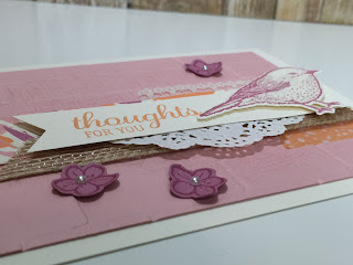
It's me again, continuing on with my creative process using the Best Birds stamp set and Birds & Blooms dies bundle.This is the card from my last post that I chose to work with. I just love how pretty these colors are together, don't you? Let me show you how adding a few different elements can really change the card.
So, I decided to start with the Blushing Bride layer. After I stamped the background stamp that is in the Best Birds stamp set in Blushing Bride ink, I ran it through the Big Shot using the Brick Wall Textured Impressions Embossing Folder, to give it some depth. Since I was inspired by the colors in the Playful Palette DSP stack, I layered a 1" strip between the Burlap ribbon and the Very Vanilla banner with the sentiment. The last thing I did was to change the size of the Pearl Basic Jewels to make them stand out a little more. Looks pretty good, huh?
Just look at all that dimension and texture!! I love it! Who wouldn't be impressed receiving this beautiful card?!
So there you have it! You can decided how much or how little you want to add to get the final result you are going for. This may also depend on the supplies you have and how much time you want to spend on creating a card.
Don't they look neat all lined up next to each other? You can really see the progression of the first card to the last.
Well, that's all for this post. Thanks a bunch for stoppin' by. Join me again for my 4th post to see how else I use the annual catalog to get inspiration for creating my cards.
Hugs,


1 comment:
I love the stepped up final version Sandy! All of those details really make it look so special and thoughtful. No way someone wouldn't appreciate all that time and effort. Good job!!!
Post a Comment